Design System
Every color, text style, surface and component Solva is built from. The styles on this page are live, so it always shows the current system.
How to use
Type /design-system in the Agent panel and describe the page you want. The agent reads this page, the color and text styles and the components below, then builds the page from instances of the existing components.
/design-system
Build a Security page at /security with a hero, four Benefits Cards, a Metrics row, three Testimonial Cards and the FAQ. End with the CTA Section.
Recommended model: GPT 6.1 Sol or higher.
01 · Colors
Solva is warm and quiet: an off-white page, stone surfaces for layering, hairline borders and three ink tones for type. Contrast and type carry the hierarchy. Status colors are for system states only.
Surfaces
Light/background
rgb(251, 250, 246)
Page background on every breakpoint.
Light/surface
rgb(244, 242, 236)
Cards, panels and section fills. Never two filled sections in a row.
Light/surface-raised
rgb(236, 233, 224)
Elements that sit on a surface: chips, icon wells, nested panels.
Edges
Light/border
rgb(231, 227, 217)
The hairline. Card edges, dividers and section borders, always 1px.
Light/border-strong
rgb(214, 208, 194)
Emphasis edges, hover and active states.
Ink
Dark/ink
rgb(28, 26, 21)
Headings, primary text and primary buttons.
Dark/body
rgb(86, 82, 74)
Paragraphs, descriptions, text buttons and icons.
Dark/muted
rgb(140, 136, 126)
Captions, metadata and secondary info.
Status
Status/error-surface
rgba(255, 34, 68, 0.15)
The Error state of the Form Button. Nothing else.
Status/warning
rgb(242, 175, 51)
The Notice banner on account pages. Not a brand color.
02 · Typography
Sentient Light gives headings a calm, editorial voice with tight tracking. Onest handles body copy, labels and buttons. Never add a third font, and never style text by hand.
Headings
Headings/Heading 1 · Page title, one per page · Sentient Light 56px, −0.05em, 1.05
The support copilot that never sleeps.
Headings/Heading 2 · Section titles · Sentient Light 48px, −0.05em, 1.05
Three ways Solva runs your support.
Headings/Heading 3 · Sub-page titles, large statements · Sentient Light 40px, −0.05em, 1.15
Every question, handled.
Headings/Heading 4 · Quotes, statements · Sentient Light 30px, −0.05em, 1.25
Now most questions resolve themselves.
Headings/Heading 5 · Card titles, group labels · Onest Regular 20px, −0.02em, 1.35
Resolve in seconds
Headings/Heading 6 · Hero subtitle · Onest Regular 18px, 1.4
An AI support copilot that resolves customer questions instantly.
Body and blog
Body/Body Large · Lead paragraph · Onest Regular 18px, 1.4
Solva keeps resolving routine tickets while your team sleeps.
Body/Body Medium · Body copy, section subtitles · Onest Regular 16px, 1.45
Solva handles sensitive customer data with the rigor your security team expects.
Body/Body Small · Names, roles, captions, metadata · Onest Regular 14px, 1.5
Head of Support at Corebit
Blog/H2 · Blog/H3 · Headings inside CMS article bodies only · Sentient Light 32px and 24px
How we cut first response time in half
What changed in the first week
Interface
These styles live inside components. They come with the instance, so don't apply them to page layers.
Other/Button Text · Buttons and text buttons · Onest Medium 14px, 1.5
Try Solva Free
Other/Eyebrow · The Eyebrow component · Onest Regular 15px, 1.3
What Solva does
Other/Pill · Announcement text in the Hero Eyebrow · Onest Regular 16px
Auto-resolution is now live
Other/Badge · NEW and Popular badges, Back Button · Onest Medium 12px
NEW
Other/Navbar Link · Navbar and Link component · Onest Regular 15px, 1.3
Integrations
Other/Menu Description · Lines under Navbar dropdown items · Onest Regular 14px, 1.4
Stories from our customers
Other/Tooltip · Text inside the Tooltip · Onest Regular 13px, 1.4
Counted per resolved ticket
Plan comparison
Only for the plan comparison table on the pricing page.
Plan Comparison/Plan Name · Column headers · Sentient Medium 20px, 1.1
Pro
Plan Comparison/Section Label · Group labels · Onest SemiBold 12px, uppercase, 0.08em
Automation
Plan Comparison/Feature · Row names · Onest Medium 15px, 1.4
Tickets per month
Plan Comparison/Value · Cell values · Onest Regular 15px, 1.4
2,000
03 · Shape and surface
Depth comes from stepping between the light tones and a hairline border. No shadows, gradients or dark fills. Cards carry their own shape, so place the instance instead of drawing one.
Page
Light/background, no radius. The default for every section.
Section fill
Light/surface across the full width, no radius. Sets one section apart, like Security on the home page. Never two in a row.
Panel
Light/surface, 16px radius, 12px padding. Holds media next to content, like the Real results block. Nested items use 10px.


Media
16px on standalone images and mockups, 10px on images inside them. Crop with overflow hidden, no border.
Radius scale
16px
Large cards, panels, standalone media.
12px
Compact list cards like Integration and Career.
10px
Buttons, inputs and media nested in a card.
100px
Pills, badges and round icon wells.
04 · Layout and spacing
Every value here is measured from the home page. Copy it instead of inventing new ones.
Spacing scale
12px
Eyebrow to heading in a section head. Testimonial columns.
16px
Between Benefits Cards.
24px
Between Feature Cards. Hero heading to subtitle.
32px
Hero text to its Large Button. Padding inside large panels.
48px
Section head to the Pricing module. Middle testimonial offset.
64px
Section head to its content. Hero bottom padding.
96px
Section padding, top and bottom, on Desktop. 72px on Tablet and Phone.
Layout rules
Page
Sections sit inside the page's Main stack, one after another. The Navbar and Footer come from the layout, so never add them to a page. Every marketing page ends with the CTA Section instance.
Section
Width 1fr, vertical stack, centered. Desktop: 96px top and bottom, 40px on the sides; the hero uses 96px top and 64px bottom. Tablet and Phone: 72px top and bottom, 24px on the sides.
Container
Width 1fr, max width 1200px, vertical stack. 64px between the section head and its content, 48px when the content is the Pricing module.
Section head
An Eyebrow instance, then a Heading 2 capped at 600 to 660px, 12px apart. An optional Body Medium subtitle is capped at 360px. Left-aligned by default. Centered only on Security and Pricing.
Card rows
Horizontal stack, every card 1fr wide. Three Feature Cards with a 24px gap. Four Benefits Cards with 16px. Three Testimonial Cards in columns 12px apart, with the middle column 48px lower.
Hero
Two columns, 0.45fr text and 0.55fr media. Hero Eyebrow, Heading 1 capped at 600px and a Heading 6 subtitle capped at 400px, 24px apart. A Large Button sits 32px below.
Breakpoints
Desktop 1200px, Tablet 810px, Phone 390px. Tablet and Phone switch every section to 72px 24px padding. Card rows stack vertically on Phone, and components switch to their Mobile variant. Check both smaller breakpoints for clipped text before finishing.
05 · Imagery
Product UI sits on a warm painted background with a 5% noise layer, cropped at 16px. Reuse the images below before sourcing anything new. Photos of people belong on company pages only.
Painted backgrounds
Every painted background on the site. Card fills and the backdrop behind product shots come only from this set.


Product shots
Solva's product screens, always on a painted background. Use one of these for the visual every marketing page needs.


People
Team and office photos from the About page. Use them only on company pages like About and Careers. Marketing and product pages show the product, not people.


Product shots
Use the Use Case Image component: a painted background with the screenshot inset. Never place a bare screenshot on the page background.
Repeats
Give every card in a row its own image. CMS cards take their images from the collection fields, never from a fixed upload.
Every page
At least one product visual within the first two sections. A page of text only is not finished.
06 · Motion
Solva's animations live inside its components. Place an instance and the motion comes with it.
Components
Hover states, the Accordion, the Logo Ticker, the Switch, Metrics and the Tooltip animate on their own. Don't recreate them with new layers.
Sticky feature blocks
Each Feature Block Card sits in its own sticky container, pinned 140px from the top, with 128px between blocks. Keep that structure when adding or removing a block.
New pages
Don't add appear effects, scroll animations or custom transitions. A calm page is part of the Solva look.
07 · Voice
Solva sounds like a support lead who has seen it all: clear, warm and specific. It promises relief, not magic.
Headings
Sentence case, ending with a period. Often two short beats: One inbox. Every question, handled.
Eyebrows
One to three words, sentence case, no period: What Solva does, Why Solva, Use cases, Security.
Card titles
Two to four words, verb first, no period: Resolve in seconds, Learn from your docs. One sentence of body below.
Metrics
A number with a suffix and a two to three word label: 62% Tickets auto-resolved, 4.8/5 Average CSAT score.
Buttons
Two or three words, action first: Try Solva Free, Get started, Contact sales.
Testimonials
One or two sentences in quotes, in the customer's words, with a concrete result. Then the name and Role at Company.
Avoid
Em dashes, exclamation marks, hype words and filler. When a block has no real facts behind it, such as numbers or names, cut the block.
08 · Components
Every element on the site is one of these components. Before drawing a button, card or list, place an instance and set its controls. Keep instances linked.
Actions
Large Button
The primary action. One per section, usually in the hero and the CTA. Outline for a second action beside it.
Primary
Outline
Small Button
Secondary actions and compact spots, like inside cards and detail pages.
Primary
Outline
Text Button, Link, Back Button
Text Button for low-emphasis actions inside cards. Link for inline and nav links. Back Button at the top of CMS detail pages.
Form Button
The submit button of every form, with its Loading, Success and Error states. Only inside forms.
Default
Loading
Disabled
Success
Error
Switch, Tab Button
Switch for the monthly and yearly toggle. Tab Button for tabbed showcases like Use Cases.
Switch, off
Switch, on
Tab, default
Auto-resolution
Tab, selected
Ticket triage
Labels and data
Eyebrow, Hero Eyebrow, Metrics, Tooltip
Eyebrow above every section title. Hero Eyebrow only in the hero, linked to an update. Metrics for animated numbers. Tooltip next to a term that needs a short explanation.
Eyebrow
What Solva does
Hero Eyebrow
Metrics
0%
0%
Tickets auto-resolved
Tooltip
Cards
Marketing cards take their text from controls. Blog, Case Study, Integration and Career cards are CMS cards: place them inside a Collection List bound to their collection.
Feature Card · three in a row, 24px gap

Benefits Card · four in a row, 16px gap
Proven compliance
SOC 2, GDPR compliant, with audit logs on demand.
Testimonial Card · three columns, 12px gap

Team Card · About page
Marcus Chen
CEO, NovaTech Industries
Blog Card · Blog collection
Integration Card · Integrations collection

Not for new pages
Owned by the layout
Navbar and Footer appear on every page through the layout. The Get Template button and its purchase overlay (Plan Overlay, Plan Content, Plan Item) belong to the template preview. Never add any of them to a page.
Account pages only
Notice and Utility / Powered by FA belong to the sign-up, sign-in, OTP and account pages, which run on FrameAuth. Leave them there.
Internal parts
Logo, Social Icon, Dropdown Link, Overlay Link, Overlay Item, Question, Pricing Card, Use Case Image and Slideshow Button live inside other components. Edit them through their parent.
Wide cards
These cards span the full container. Feature Block Cards sit in sticky containers, Case Study and Career cards fill CMS lists.
Feature Block Card · Right and Left variants, one per sticky container

Case Study Card · Customers collection
Career Card · Careers collection
Section modules
Whole blocks that fill a section's content area. Place them full width under a section head. Edit their content inside the component, not by drawing new rows.
Pricing · plans with the monthly and yearly switch, 48px under its head

Use Cases · tabbed showcase


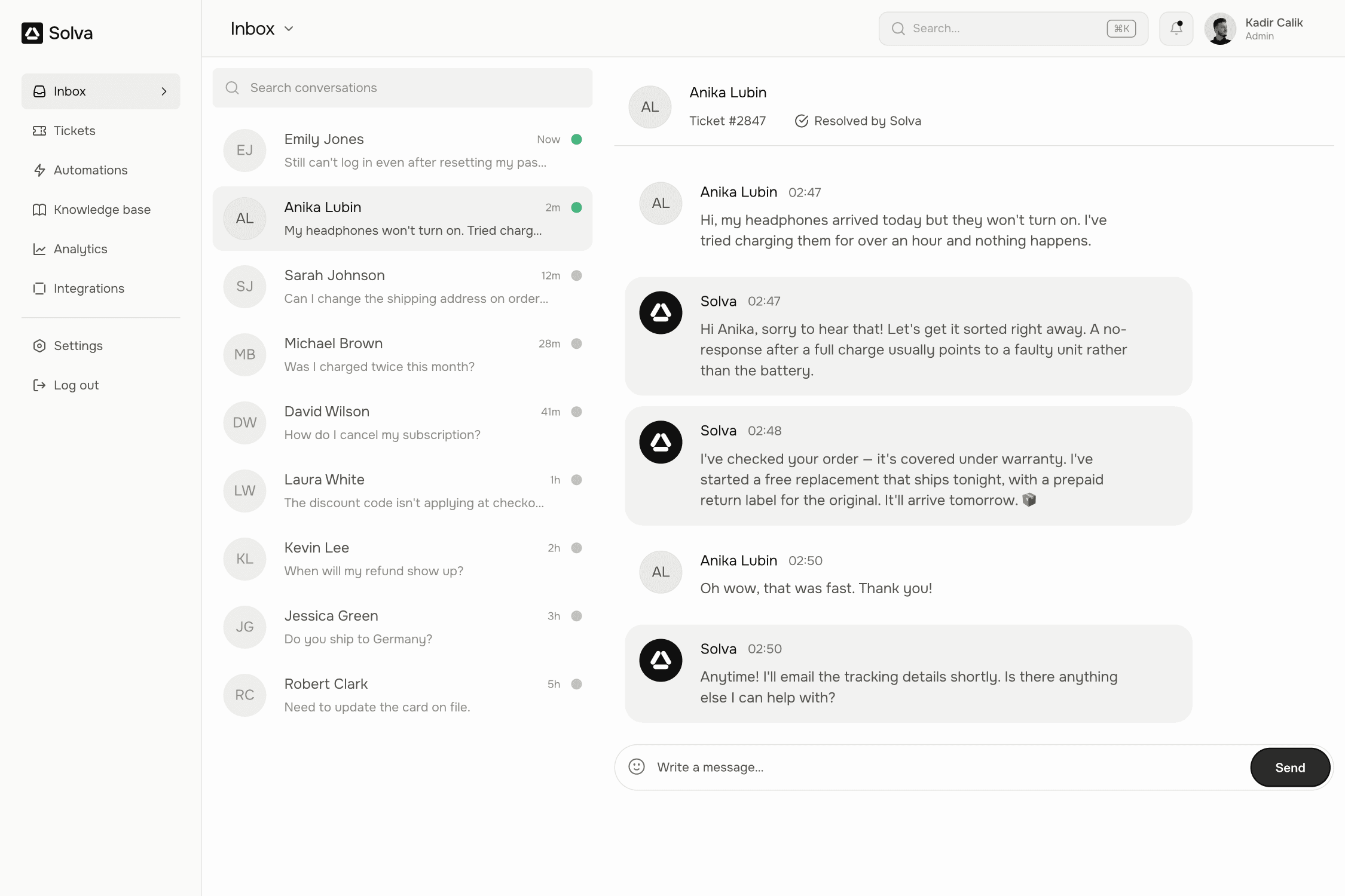


Accordion · the FAQ list
Logo Ticker · under the hero or pricing, max width 600px when inline
Video Preview · inside a Panel, 0.4fr next to 0.6fr content

CTA Section · the closing block of every marketing page, full width